The bottleneck was never building
AI made it easier to try ideas. Design taste told me which ones were worth taking further.
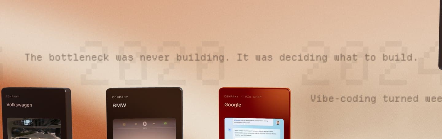
My showcase page is a timeline of projects. A single line of text sits between two of the cards:
“The bottleneck was never building. It was deciding what to build.”
I wrote it about product design.
It turned out to be about this website, too.
Building was the easy part
Design portfolios used to be collections of case studies. Now they're products, and shipping one is part of the proof.
I rebuilt this site with Claude Code. It's a Next.js app with a 3D timeline, a fake terminal, a command palette, and enough polish to keep me busy for weeks.
AI made the first version happen fast. It also made it easy to say yes to one more thing. By the end, I had more ideas than this site could carry.
I stopped asking, “Can I build this?” and started asking whether it belonged.
Which things should lead. Which could stay hidden. Which were fun for five minutes but didn't earn their place.
So this isn't a tour of what I shipped. It's about three things I put somewhere less obvious, and why I left them there.
Scroll to enter
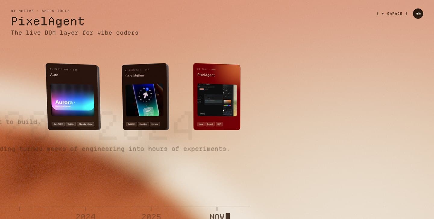
The showcase is the biggest thing I built. Ten glass cards sit along a 2016 to 2026 timeline. Side projects float above the axis. Company work sits below.
There's no button.
Instead, the homepage ends with something that looks like a terminal prompt:
bryan@garage ~ % showcase --3d-timeline
[░░░░░░░░░░░░░░░░░░░░░░░░] scroll to run
When you reach the bottom of the page, your extra scroll starts filling the progress bar. About 1,200 pixels of wheel movement fills all 24 cells. The label changes from scroll to run, to loading timeline…, to entering /showcase. A dithered pixel field rises from the bottom of the screen like phosphor warming up. At 100%, a WebGL transition carries you into the timeline.

Stop scrolling, and it drains back in under a second. A stray scroll never leaves it half-lit.
The idea is simple. The site's identity is a command line. So entering its centerpiece should feel like running a command. Not clicking a button that looks like one.
I only let myself do this because, underneath the theatrics, it's a normal <a href="/showcase">. The command text is server-rendered. It works with keyboard navigation. It works with JavaScript disabled. The interaction is decoration layered on top of a normal link. That's the only reason I let myself build it.
The entrance that silenced the room
The gamble had a consequence I didn't anticipate.
Browsers don't treat scrolling as user activation. Otherwise every website could start talking the moment you touched the wheel. Clicks count. Key presses count. Scrolling doesn't.
The timeline has sound, generated live in the browser. Each card that passes the center gets a soft chime. Scroll slowly and the notes arrive one at a time. Move faster and they start to feel like a little melody.
Which meant I'd designed an entrance that guaranteed the thing behind it would be silent. Two of my favorite ideas on the site were quietly incompatible. I didn't discover it through a bug report. I discovered it because the page felt wrong.
The fix had three parts. Only one of them was clever.
The AudioContext became a module-level singleton. The homepage quietly waits for the first real user gesture, then starts the context at zero volume. Nothing plays on the homepage. The audio is simply warm before you arrive.
An earlier version had a bug that's worth mentioning because it's exactly the kind you only discover by shipping. It saw the first wheel event, assumed that counted, removed all its listeners, and permanently gave up. The context never started. The page stayed silent even if you clicked twenty times afterward. The fix wasn't complicated. Stop trusting the attempt. Keep listening until the browser actually reports that the context is running.
The third fix wasn't code at all. The speaker icon used to say sound was on because I'd flipped a boolean. Meanwhile the page was objectively silent. Now the icon reflects reality. If audio isn't available yet, it says so.
That's the part I keep thinking about. AI wrote most of the audio graph. It didn't question the speaker icon because I never asked it to. The icon looked finished, but it was promising sound that wasn't there. That's what I mean when I say the work moved.
The terminal you have to find
There's a CLI on the homepage. It boots for 4.8 seconds behind a fake loading bar, types an ASCII wordmark into itself, and responds to commands from projects and contact to coffee and sudo.
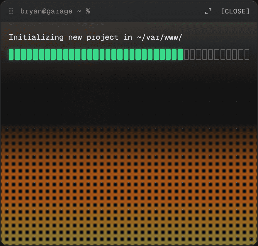
It's one of the most carefully designed parts of the site. And it isn't on the page. You get a tiny >_tucked into the corner. That's it.
Every instinct from ten years of product design says this is wrong. Make features discoverable. Don't hide the good stuff. I hid the good stuff anyway.
Because a terminal you're handed is a widget. A terminal you discover is a room. The whole idea only works if curiosity gets rewarded. Once you explain where everything is, you've taken away the reason to explore. So the prompt pulses once on a first visit. After that, you're on your own.
It's a tradeoff. Most visitors will never touch it. I'm not convinced it's the right decision. I am convinced it's a decision. I'd rather own the tradeoff than pretend it tested well.
A contact page that flies away
Nobody wants another contact form. A name field, an email field, a send button. You reach the bottom of a site, see it, and leave.
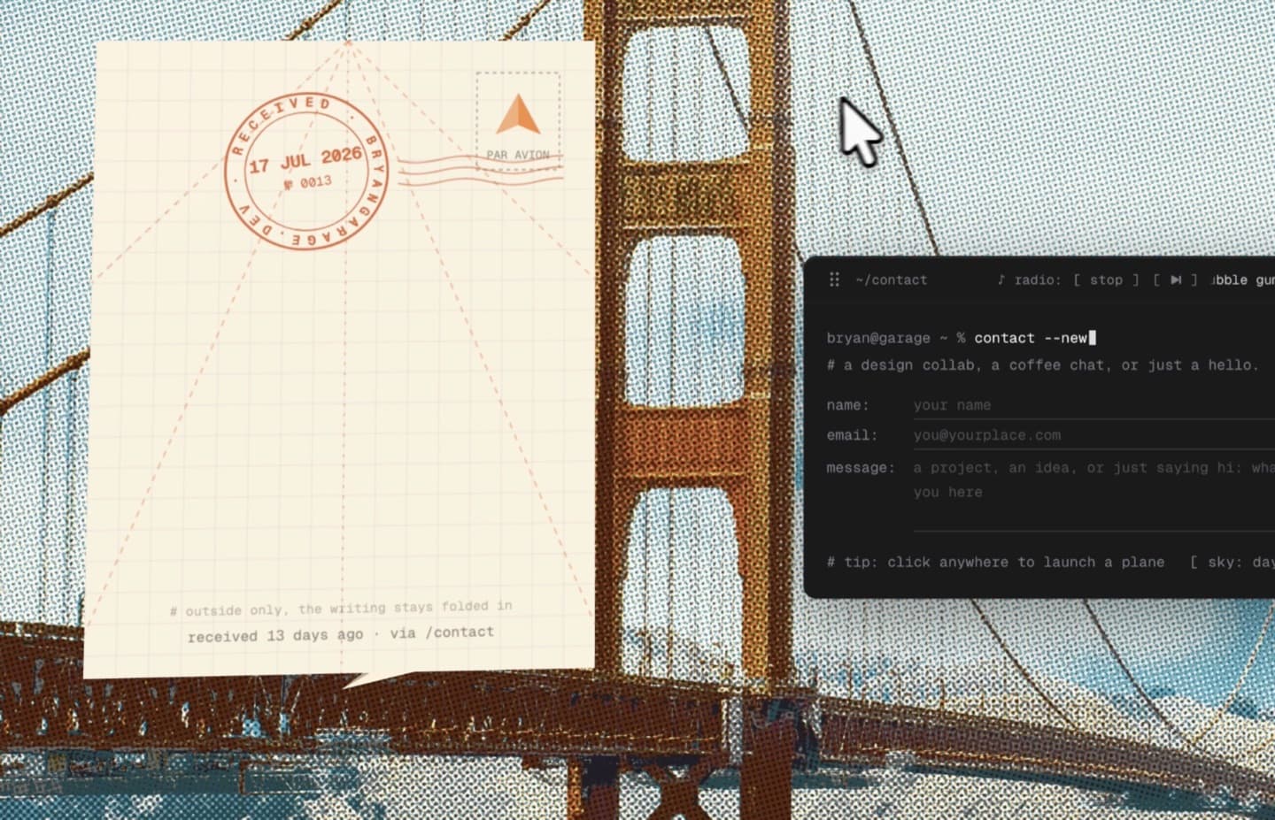
So I tried to make one I'd want to use. You type a note, hit send, and it prints out of the terminal, folds into a paper plane, then flies away. The fold isn't a video. It's a real Three.js mesh, with every panel moving on its own hinge.
Paper Planes from Google I/O 2016 stayed with me for years. This started as my own small version of that feeling: a thing on the web that had no reason to be this playful, except that it could be.
People who tried the first version sent ideas, and many of them made it into the next one. Now the terminal boot sends a flock of planes across the screen. A sky: day command turns the Golden Gate into golden hour. There's a tiny garage radio tucked into the terminal, too.
None of that makes an email faster. It does give an ordinary action a small payoff. A contact page doesn't have to be memorable, but it gets to be.
Small moments of surprise
The useful things are easy to find: the work, a way to get in touch, and the places I want people to visit. The rest is there for anyone who looks twice.
The CLI, the scroll into the timeline, and the contact page are small moments of surprise. Not because a site needs tricks, but because the web is better when it gives you a reason to stay a little longer.
They still have to work. The terminal has a keyboard path. The scroll gate is a real link underneath. The surprise is never the only way through.
What I learned by making it
With AI, I could turn an idea into something I could try in the browser almost immediately.
Once it was real, I could see what the site needed. Which details made it feel more like me. Which ones were getting in the way. Which ideas were worth another pass.
AI helped me build faster. It didn't decide what the experience should feel like. That is where design taste comes in.